In today’s world, understanding how a website performs is important for improving content and reaching the correct audience. This analysis uses Google Analytics 4 (GA4) to take a deeper look at the data, such as page views, engagement, and demographics. These metrics help show how users are finding the website, what content they are most interested in, and where the users are coming from.
User acquisition helps us to identify how new visitors to the page are finding our website and what sources are bringing in the most traffic. Page views help us to understand what pages are being visited more than others, which allows us to know what content is bringing in the most people. Engagement metrics such as engagement times and rates help us measure how the users are interacting with the site and for how long they are staying on the site. Demographic data, such as country and city, helps us see where our users are located and if the website is reaching the correct audience.
Throughout this process, we will also be using ChatGPT to help us analyze the data and explain what each metric means. This will help make it easier to understand the patterns in the users’ behavior and identify ways to improve the website’s performance.
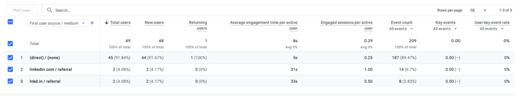
User acquisition- First user source/medium
The first user source/medium is used to show where users are coming from when they first visit the website, helping identify platforms or sources, such as direct traffic, search engines, or referrals, bring in the most users. This is important because it shows which marketing efforts are most effective and where improvements can be made. The metric average engagement time shows how long users stay on the website after arriving from each source, with higher times indicating greater interest in the content. The new users metric helps show how many first-time visitors are coming from each, which is useful for understanding how the website is growing its audience. The engagement rate measures the percentage of users who are actively interacting with the site. Based on the data, direct traffic brings in the highest number of users, while LinkedIn.com and lnkd.in/referral shows varying levels of engagement, which suggests that some channels may attract more interested visitors than others.
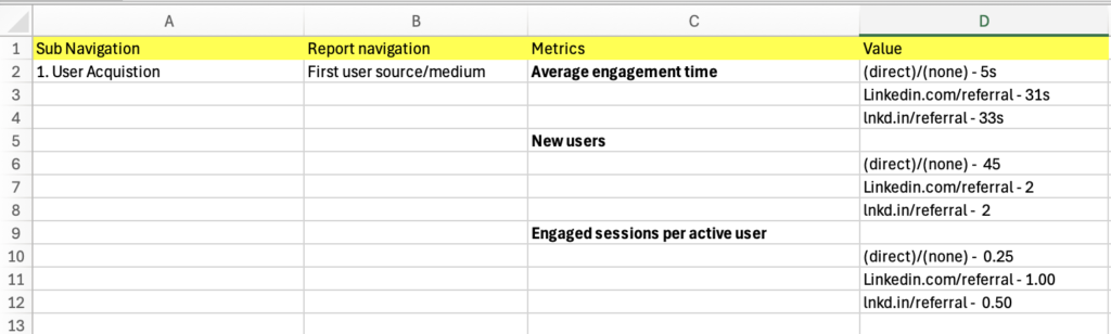
After gathering this information, I entered the relevant information into an Excel sheet to make the information more organized and easier to put into ChatGPT to analyze. Here is the Excel information below.
After I organized the information in Excel, I entered it into ChatGPT in addition to specific prompts to assist in analyzing and understanding what exactly these metrics mean. I copied and pasted the values for the average engagement time, and then I gave ChatGPT a prompt. The prompt I used was: When I sorted the average engagement time in descending order in the First user source/medium classification, the following results came out. Please explain. Here are the results that ChatGPT gave me
Here’s how to interpret those results in a simple way:
1. direct / (none) – 5 seconds
- This means people came directly to your website (no referral source tracked).
- Examples:
- Typed your URL into the browser
- Used a bookmark
- Clicked an untracked link (like from texts or some apps)
👉 Why engagement is low (5s):
These users are leaving almost immediately, which usually means:
- They didn’t find what they expected
- The page didn’t load well or wasn’t engaging
- It could even include accidental clicks
📌 Takeaway: This traffic is low quality or mismatched—you may want to improve your landing page or check where these users are coming from.
2. linkedin.com / referral – 31 seconds
- These users clicked a link from LinkedIn directly (full URL shown).
👉 Why engagement is higher:
- They likely saw a post, profile, or company page
- They had some interest before clicking
📌 Takeaway:
LinkedIn is bringing more engaged users than direct traffic.
3. lnkd.in / referral – 33 seconds
- This is also LinkedIn traffic, but through shortened links (LinkedIn uses
lnkd.infor shared links).
👉 Why it’s slightly higher (33s):
- These are often links shared in:
- Posts
- Messages
- Comments
- People clicking these are usually more intentional
📌 Takeaway:
This is actually your most engaged traffic source of the three.
Overall Insight (what this tells you)
- Best traffic: LinkedIn (especially shortened links) → people stay longer
- Worst traffic: Direct → people leave almost instantly
- LinkedIn referrals generate higher engagement because users arrive with prior interest, while direct traffic shows very low engagement, suggesting weaker intent or poor landing page effectiveness.
After this, I went on to the next section, where I used ChatGPT to analyze the data I collected from new users to the website. I copied and pasted the next three cells under the values heading that corresponded to new users. I then gave ChatGPT this prompt: When I sorted the new users in descending order in the First user source/ medium classification, the following result came out. Please explain. Below was what ChatGPT responded with.
Here’s what your results mean in a simple, clear way:
📊 Your Data
- (direct) / (none) — 45 new users
- linkedin.com / referral — 2 new users
- lnkd.in / referral — 2 new users
🧠 What “new users” means
“New users” = people visiting your website for the very first time
So you’re basically seeing where your first-time visitors are coming from
🔍 Explanation of each source
1. (direct) / (none) — 45 (MOST of your traffic)
This means people came to your site without a tracked source
This usually happens when they:
- Typed your website URL directly
- Clicked a bookmark
- Clicked a link in a text message or DM
- Clicked from apps that don’t pass tracking data (like some emails or social apps)
👉 Why it’s so high:
Most of your new users didn’t come from trackable marketing links—they found your site more “privately” or directly.
2. linkedin.com / referral — 2
These users:
- Clicked a link to your site from LinkedIn
- Came from the actual LinkedIn website
👉 This shows:
- You do have some traffic coming from LinkedIn posts or profiles
- But it’s very small compared to direct traffic
3. lnkd.in / referral — 2
This is also from LinkedIn, but slightly different:
- lnkd.in is LinkedIn’s shortened link
- Happens when someone shares a shortened LinkedIn link (common in posts/messages)
👉 So these 2 users also came from LinkedIn—just via a shortened link
📌 Big Picture Insight
- Your site is getting most new users from “direct” traffic (45 vs 4 from LinkedIn)
- LinkedIn is contributing very little traffic overall
As for the last section, I used ChatGPT to analyze the data I collected on the engaged users per activate session. I gave ChatGPT another prompt followed by the last three cells under the value heading that are related to engaged users per active session. Here is the prompt I used: When I sorted the engaged sessions per active user in descending order in the First user source/medium classification, the following results came out. Please explain. Here are the results ChatGPT gave me.
Here’s how to understand this metric and your results:
🧠 What “Engaged sessions per active user” means
This measures how engaged each user is on average
👉 Formula (conceptually):
Engaged sessions ÷ Active users
- An engaged session = a visit where the user actually interacts (stays longer, clicks, views multiple pages, etc.)
- An active user = a person who visited your site
👉 So:
- Higher number = more engagement per person
- Lower number = less interaction per person
📊 Your Results Explained
1. linkedin.com / referral — 1.00 (HIGHEST)
- Each user from LinkedIn had about 1 engaged session per user
- This means:
- Almost every LinkedIn visitor actively interacted with your site
👉 💡 Insight:
LinkedIn users are high-quality traffic — fewer people, but more engaged
2. lnkd.in / referral — 0.50
- Each user had about 0.5 engaged sessions
- This means:
- Some users engaged, some didn’t
👉 💡 Insight:
Still decent engagement, but not as strong as direct LinkedIn traffic
3. (direct) / (none) — 0.25 (LOWEST)
- Only 0.25 engaged sessions per user
- This means:
- Most users coming directly are not interacting much
👉 💡 Insight:
You have a lot of direct traffic, but it’s low quality / low engagement
📌 Big Picture Takeaway
- Direct traffic = high volume, low engagement
- LinkedIn traffic = low volume, high engagement
Engagement- Page title and screens
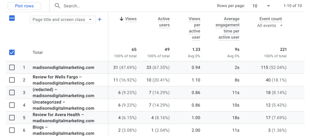
We can use the page titles and screens to determine which pages, or in our case, blog posts, are seeing the most engagement. The metrics analyzed in this section include average engagement time, views, and new users. Average engagement time measures how long users spend interacting with the page content; higher times indicate there is great interest and engagement. Views represent how often the content is seen; this helps show how effectively it is being discovered through promotional efforts. Lastly, new users indicate the number of first-time visitors to the site, which helps measure audience growth. The image below displays GA4 analytics data highlighting these three metrics for the blog website currently being viewed.
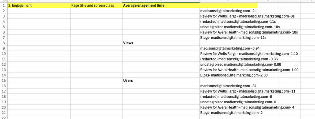
After collecting this information, I then entered in the relevant information into an Excel spreadsheet to help make it easier for ChatGPT to analyze and transfer it over to ChatGPT. Below is the spreadsheet information.
Now that I have fully organized the information in the Excel spreadsheet, I entered this information along with new specific prompts into ChatGPT to help further analyze and understand these metrics. I entered in a prompt to ChatGPT followed by copying and pasting the first six cells of information on the right side related to average engagement time. The prompt I used was: When I sorted the average engagement time in descending order in the page title and screen class classification, the following results came out. Please explain. Below are the results from ChatGPT.
When you sort average engagement time (descending) by Page title and screen class, you’re basically seeing which pages keep users’ attention the longest → shortest. Here’s what your results are telling you:
🔝 Highest Engagement
- Review for Avera Health – 18s
This page has the highest engagement time, meaning visitors are spending the most time here.
👉 Likely reasons: - The content is interesting or detailed
- Users are actually reading the full review
- Could be more relevant to your audience
📊 Mid-Level Engagement
- (redacted) – 11s
- Blogs – 11s
- Uncategorized – 10s
- Review for Wells Fargo – 8s
These pages have moderate engagement, meaning:
- People are spending some time, but not a lot
- They might be skimming instead of fully reading
- Content may not be as engaging or clear
👉 Example:
- Your Blogs page (11s) might not be pulling people in enough to stay longer
- The Wells Fargo review (8s) could be less interesting or shorter than Avera
⚠️ Lowest Engagement
- madisonsdigitalmarketing.com (homepage) – 2s
This is a big insight.
👉 A 2-second engagement time usually means:
- Users are leaving almost immediately
- They might not find what they expected
- The homepage may not be visually engaging or clear
🧠 Overall Explanation (what this means)
- Pages with higher engagement time = more interesting or useful content
- Pages with lower engagement time = users are leaving quickly or not interacting
For the next section, I used ChatGPT to analyze data regarding views on the site. I entered a prompt, followed by copying and pasting the next six rows on the far right side related to views. This was the prompt I used: When I sorted the views in descending order in the page title and screen class classification, the following results came out. Please explain. Here was ChatGPT’s response.
When you sort views (descending) by Page title and screen class, you’re looking at which pages are being seen the most → least. Here’s what your results mean:
🔝 Most Viewed Page
- Blogs – 2.00
This page has the highest number of views, meaning:
👉 It is the most visited page on your site
👉 Your blog content is what people are finding the most
👉 This could be from sharing links, SEO, or internal navigation
📊 Moderate Views
- Review for Wells Fargo – 1.10
- Review for Avera Health – 1.00
These pages are getting some traffic, but not as much as the blog:
👉 People are finding these reviews, but they’re not as popular
👉 Could mean less promotion or less interest compared to blogs
⚖️ Lower Views
- madisonsdigitalmarketing.com (homepage) – 0.94
- (redacted) – 0.86
- Uncategorized – 0.86
These pages have the lowest views, meaning:
👉 Fewer users are visiting them
👉 They may not be easily accessible or well-promoted
👉 Could also mean users are not navigating to these pages from your homepage
🧠 Overall Explanation (what this shows)
- Pages with higher views = more visibility and traffic
- Pages with lower views = less discovery or weaker promotion
Your results show that:
👉 The Blogs page is performing the best in terms of traffic
👉 Review pages are doing okay but could improve
👉 Other pages (like homepage or uncategorized) are not getting much attention
For the last section, I used ChatGPT to analyze the new users who had visited the website. I entered the new prompt followed by the last six cells that correspond to new users. Here is the prompt I gave ChatGPT: When I sorted the users in descending order in the page and title screen class classification, the following results came out. Please explain. This was ChatGPT’s response.
When you sort users (descending) by Page title and screen class, you’re seeing which pages are attracting the most individual visitors → least. Here’s what your results show:
🔝 Most Users
- madisonsdigitalmarketing.com (homepage) – 31
This page has the highest number of users, meaning:
👉 Most people are landing on your homepage first
👉 It acts as the main entry point to your website
👉 This is normal for most websites
📊 Moderate Users
- Review for Wells Fargo – 11
👉 This page is getting a decent number of visitors
👉 Some users are navigating from the homepage to this review
👉 It shows moderate interest in this topic
⚖️ Lower Users
- (redacted) – 6
- Uncategorized – 6
👉 These pages are getting fewer visitors
👉 They may not be easy to find or not strongly promoted
👉 Users may not be clicking into these pages as often
⬇️ Lowest Users
- Review for Avera Health – 4
- Blogs – 2
👉 These pages have the fewest users, meaning:
- Very few people are reaching them
- They may need better visibility (links, SEO, or promotion)
- Even though blogs had high views earlier, fewer unique users may mean:
- The same users are viewing it multiple times, or
- It’s not reaching new visitors
🧠 Overall Explanation
- Users = number of individual visitors
- Higher users = more people visiting that page
- Lower users = fewer people discovering or clicking into it
Your data shows:
👉 The homepage brings in most users
👉 Some users explore review pages
👉 Other pages (especially blogs) are not attracting many unique visitors
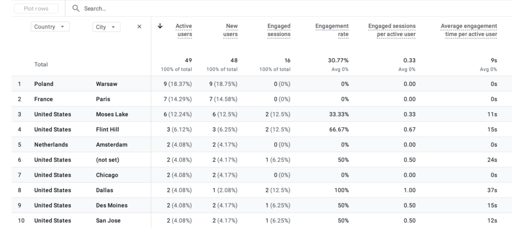
User attributes – Demographic details
For the demographic analysis, the focus is on users’ country and city to determine whether the website is reaching its intended target audience. The key metrics used in this section include active users, engagement rate, average engagement time per active user, and engaged sessions per active user. Active users indicate how many visitors are coming from each location, while engagement rate shows the percentage of users who are interacting with the content. Average engagement time per active user measures how deeply users from each location engage with the website. Engaged sessions per active user reflect how frequently users from each location return and interact with the site.
The image below displays the GA4 analytics for these demographic metrics on the blog website.
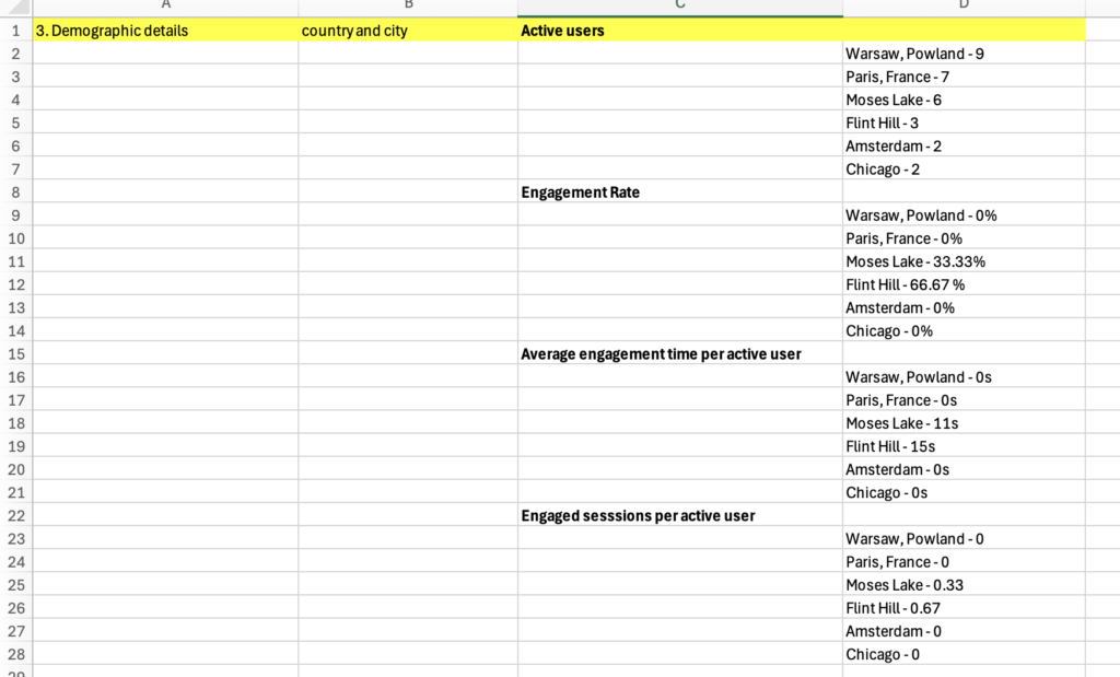
Now that I have located the information, I entered a few locations and their information into an Excel sheet so it will be easier to identify and use this information to be further analyzed with the help of ChatGPT. Below is the Excel sheet.
Now that we have organized the information, I will use ChatGPT to take a deeper look into the information. For this portion, we group all four metrics into one prompt and had ChatGPT only give us one response instead of multiple responses. The prompt I used was: Let’s begin the analysis assuming my cities of interest are Warsaw, Paris, Moses Lake, Flint Hill, Amsterdam, and Chicago. When I sorted Active users in descending order in the Country and city classification, the following result came out. Please explain <add data on Active users here>. When I sorted the engagement rate in descending order in the Country and city classification, the following result came out. Please explain <add data on Engagement rate here>. When I sorted Average engagement time per active user in descending order in the Country and city classification, the following result came out. Please explain <add data on Average engagement time per active user here>. When I sorted Engaged sessions per active user in descending order in the Country and city classification, the following result came out. Please explain <add data on Engaged sessions per active user here>. Finally, please provide a conclusion based on the answers to these four questions. I would then follow the prompt by copying and pasting the corresponding Excel sheet information into each of the areas that said to add data here to get the completed prompt. This was the result from ChatGPT.
1. Active Users (Descending Order):
- Warsaw, Poland (9 users): Highest number of active users, meaning this location drives the most traffic to the website.
- Paris, France (7 users): Second highest traffic, showing strong visibility in this location.
- Moses Lake (6 users): Moderate number of users visiting the site.
- Flint Hill (3 users): Lower traffic compared to the top cities.
- Amsterdam (2 users): Minimal traffic.
- Chicago (2 users): Also minimal traffic.
2. Engagement Rate (Descending Order):
- Flint Hill (66.67%): Highest engagement rate, meaning users here interact the most with the content.
- Moses Lake (33.33%): Moderate engagement, showing some user interaction.
- Warsaw, Poland (0%): No engagement despite high traffic.
- Paris, France (0%): Users are visiting but not interacting.
- Amsterdam (0%): No engagement.
- Chicago (0%): No engagement.
3. Average Engagement Time per Active User (Descending Order):
- Flint Hill (15s): Highest time spent, indicating strong interest in the content.
- Moses Lake (11s): Moderate engagement time.
- Warsaw, Poland (0s): No time spent engaging with content.
- Paris, France (0s): Users leave quickly.
- Amsterdam (0s): No engagement time.
- Chicago (0s): No engagement time.
4. Engaged Sessions per Active User (Descending Order):
- Flint Hill (0.67): Highest return and interaction rate.
- Moses Lake (0.33): Some repeat engagement.
- Warsaw, Poland (0): No engaged sessions.
- Paris, France (0): No engaged sessions.
- Amsterdam (0): No engaged sessions.
- Chicago (0): No engaged sessions.
Conclusion:
- Cities like Warsaw and Paris bring in the most users, but those users are not engaging with the content.
- Flint Hill and Moses Lake have fewer users but much higher engagement, meaning the content is more relevant to those audiences.
- This suggests the website is reaching a broad audience but only strongly connecting with certain locations. Improving content or targeting for high-traffic cities could help increase overall engagement.
Conclusion
This process demonstrates how Google Analytics (GA4) can be used to evaluate website performance and identify the audience it is reaching. It helps highlight areas where the website is performing well and areas where the website may need improvement. By using AI tools like ChatGPT, the data collected from Google Analytics can be further analyzed by inputting it along with certain prompts, allowing us to gain a deeper understanding of what the metrics mean and how they are impacting the overall performance of the website
Leave a Reply